On the surface, a pulpy retro superhero movie wouldn't seem like it has much to say about the world we live in. Even with the film's simplicity, I think there's an element of it that is very profound. Normally, when we think of superheroes, we think of traditionally masculine, cisgender and straight white men. Yes minority heroes exist in comics and film, but most of them are far less known, and often times their identity plays a focus in their stories.


The Abnormals takes a different approach. Of the actors who make up the main trio of superheroes, one is Black, the other is a transgender man, and the other is a female. The film never addresses these identities, and what this tells the audience is that not only are these underrepresented individuals just as capable of fitting the aspirational roles the media often denies them, it does not have to define them. Astroknight, Cryptid Kid, and Showstopper are allowed to be superheroes without having to be labeled as minority superheroes. They can exist beyond labels and perception. This logic also applies to Blackout, a villain in the film.
Blackout is an take on the sci-fi and fantasy dark lord archetype, however while many of those characters are men, Blackout is a woman. This shows how women in media don't have to be restricted to roles the idealize them, they can also show a dark and witty side, one that represents an aspect of humanity that is often considered undesirable, but through the character of the supervillain, becomes fun and magnetic.

Like the members of many superhero teams, each member of The Abnormals has a distinct color that represents them, which in this particular film is shown both in their hero costumes and their civilian outfits. Astrokinight is blue, Cryptid Kid is green, and Showstopper is red. This element of mis-en-scene gives an iconic and recognizable nature to the characters, which is reflected in the marketing. The character posters for the film, posted on Instagram, reinforce the color associations. The backgrounds of the posters and the individual character logos fit whatever the color scheme is of the character they represent, and this applies to the villains as well as the heroes even though their colors aren't as dominant in their costumes. Throughout the marketing materials posted to Instagram, blue and green are the brand colors. They're the colors used on the movie's logo, which appears on all posters, and the headings on the posts introducing the cast and director.


This usage of color make all of the marketing materials feel cohesive. Additionally, all the posters following the initial teaser poster contain a spiral background, which represents the retro inspiration for the movie while acting as a symbol that brands the posts and acts as something an audience member can associate with the movie. The spiral, as well as the blue and green logo, appear in the movie itself and further establish elements and symbols that brand the movie. The spiral, as well as the logo and color palate appear on the postcard, the front side of which is a re-edit of the main poster. This makes the two objects feel related and shows that they aim for the same marketing purpose. In addition to all of this, each post on Instagram ends with #theabnormalsmovie which makes them all connected, and variations of films tagline, "This Spring, suit up", appear in the captions of various posts as well as on the main poster and the bio for the account.

The film itself engages with the audience with the audience with techniques meant to keep a high energy feel and keep the viewers attention. This includes the musical score, whip pans that highlight shocking or important moments, close ups that make the viewer feel more connected to the emotions and situations of the characters, and tracking shots that create a feeling of exciting motion while highlighting the importance of every character in the ensemble by showing them together. The music is primarily surf rock during intense moments like the suit-up montage, and synth during the rest of the movie, which is used to create emotions such as excitement, suspense, and mystery. Both genres listed are associated with nostalgia and a vintage feeling, something that is carried throughout the entire movie. Much of the film is a pastiche of classic comic books and superhero TV shows, shown through the heightened and campy dialogue and performances and the comic book inspired transitions between shots, like the wipes. In many ways, the film acts as a way for modern audiences to experience a kind of filmmaking that is no longer fashionable. The Abnormals is a movie that many would consider "uncool", and the inherit strangeness of a movie that is trying to be "uncool" is what makes it, to many, cool because of how it rejects modern conventions.

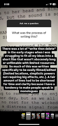
In terms of the social media, many of the posts were proceeded by stories that built anticipation for what was about to be revealed. There was also the Q&A, where I personally answered questions for audience members, and the villain video submissions, where I invited audience members to appear in the movie itself by sending clips of themself. These clips are only seen in the extended version of the film posted to YouTube.
I did a lot of research into the aesthetic of comic books, as I wanted The Abnormals to feel like a comic book come to life. One element of comics that made it's way into the story is how they often end on cliffhangers, which inspired the cliffhanger ending of the movie where Blackout returns for revenge and the team prepares for battle. I was also inspired by the yellow boxes that contain the text of a location, something that appears in the movie, panels that highlight the characters posed in a group, which influenced many shots of the main trio, and the way that comic books use bright and poppy colors.


